Part 1: Intoduction to the Role Manager
This is the first in a series of articles about how and why to use the Role Manager. This is a big subject, and although it’s not particularly complex there is a lot to cover – one of the key features of e-Quip is the numerous ways in which it can be customised. For this reason this topic will be presented over 3 or 4 separate articles.
Your are probably all familiar with the concept of user groups; to use e-Quip you need a user account, and each account is a member of a single group. The group defines the attributes which all members of the group share. These are:
a) Item Permissions
b) Data Footprint
Item Permissions
Every data item in e-Quip is protected by a permissions mask. This can be any combination of: Read, Write, Add, Delete and Control. Note that links between items are also protected in the same way. Jobs, for example, have a permissions mask, as do spare parts; but importantly the ability to link spare parts to jobs is controlled by its own mask. In order to add spare parts to a job a user must have at least the following rights:
a) Jobs: Read + Write
If you can’t read jobs then you won’t be able to see the job, if you can’t edit jobs, then you won’t be able to click “Unlock” on the job property page.
b) Spare Parts: Read
If you can’t read spare parts then you won’t be able to choose any parts to add.
c) Spare Part Job Link: Read + Write + Add
If you don’t have at least read access then the spare parts tab will not be displayed. If you don’t have add rights then the template row at the bottom of the parts grid will not be displayed, and if you don’t have edit you won’t be able to make any changes to a row in the grid.
Data Footprint
Your account’s data footprint defines which parts of the database you can see. Having read access to jobs, for examples, means that you can display jobs. Your footprint, however, defines which jobs you will be able to see. Footprints allow different groups of users to be able to see different parts of the database. In this way, Renal data, for example, can be made invisible to X-Ray users (and no, I don’t mean that you can’t see through renal equipment with x-rays!), and vice-versa.
Differences between Groups and Roles
Roles are used to control the appearance and behaviour of the system. Roles apply to one or more groups. Suppose that your database has data for three hospitals; the engineers at each site might only want to see equipment for that site, in which case, three separate groups would be required, each with a different footprint (but probably the same permissions). However, if you want the system to appear and behave the same for all of them you would create a single role and add all three groups to it. In this example you might have the following groups:
Engineers – Barts Hospital
Engineers – Royal London Hospital
Engineers – Newham Hospital
Engineers – Whipps Cross Hospital
And a single role:
Engineers
Some of the appearance-related features defined by a role include:
a) The configuration of the Office ribbon
b) Default grid layouts for each screen
c) The tabs which are visible for each property page
d) Hidden & locked fields on the equipment & job property pages
e) The menus which are visible on every screen
f) The visible dashboard items
Some of the behaviour features controlled by roles are:
a) Default equipment & job status values
b) The relationship between job status values and dates (and vice-versa)
c) The actions taken when decommissioning devices
d) Base filters (filters that a user cannot remove)
e) Access to bulk update
f) … and much more besides
Role Appearance Settings
Using the Group Manager to deny a group read access to a data item does not by itself actually hide the screen that the item is displayed on. For example, if a group has no read access to the Medical Device Alert screen, that screen will be visible, but it will always be empty for members of the group (since they do not have permission to see device alerts). If users could still see all of the screens that they had no access to the e-Quip user-interface would be very crowded and confused. Similarly, not having delete rights on a particular screen does not by itself remove the Delete menu for that screen. One feature of roles is that they simplify the user-interface by hiding things which are not relevant.
The most common items that are hidden are:
Office Ribbon Items
Menus
Property Page Tabs
Configuring the Ribbon Strip
The Microsoft Office ribbon is made up of tabs which contain groups, which in turn contain icons. Sometimes these icons are referred to as controls or tools.
In the example below the ribbon tabs are: Inventory, Work, Equipment Library, Training and Device Alerts.
Within the Inventory tab the following groups are displayed: Inventory, Product Information, Print, Searching & Selection and Grid Options. Within the Inventory group the following tools are displayed: Assets, Decontamination History and Leases.
If the members of a role did not need to be concerned with invoicing then that tab could be hidden. This would in turn hide all groups and tools within that tab. Alternatively, if a collection of users did not need to see the Product Information group, then this too could be hidden, which would also hide the tools within that group. Finally, if the users needed to see assets but not decontamination history and leases, then these individual controls could be hidden.
The example below shows a customised ribbon.
Configuring Menus
This is relatively straightforward, but some information about how menus work is useful before you start. Firstly, E-Quip has two menus:
a) The Application Control Menu
b) The Context Menu
The first of these is shown by clicking the application icon, which is the circular icon at the top left-hand side of the ribbon. Context menus are invoked by right-clicking the mouse anywhere within the grid.
Each menu has 3 different sets of options, depending on the number of records that are selected in the grid. Cleally, if nothing is selected, then Delete, Properties and Save As will not be visible; if a single record is selected then Save As will be visible, but if multiple records are selected then it will not.
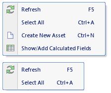
This means that for each screen there are 6 possible menu configurations. The example below shows 2 versions of the same menu.
Configuring Property Page Tabs
It may be the case that some property page tabs might not be relevant to certain users; perhaps they can see job technical data but financial information might be of no interest to them. Hiding property page tabs is extremely simple, but remember that the first tab (often called General or Details) of all property pages cannot be hidden.
Shown below are 2 versions of the loan screen.
That’s enough for now. The next article will discuss how roles can be used to control the behaviour of the system.


