Just in case you think we’ve been taking things easy over lockdown, here is some information about a new feature that we have been working on.
You may not have noticed, but version 4.2 saw the introduction of dashboard snapshots, which allow you to save any dashboard and re-open it later. Snapshots were always intended to be the first step in adding a mechanism to allow changes in performance to be monitored.
Suppose that the dashboard highlights some performance issue that you need to address. For example, perhaps response times for urgent jobs are unacceptably long around the summer holidays and Christmas. You might then devise some cunning plan to improve this, perhaps by rescheduling planned maintenance to free up resources around the holidays. You wait 12 months for this change to have an impact and then run the dashboard again. While you can visually compare the latest dashboard side-by-side with the saved snapshot, it would be better if you could analyse and display the differences between them. It would be more useful still if you could do this for several snapshots.
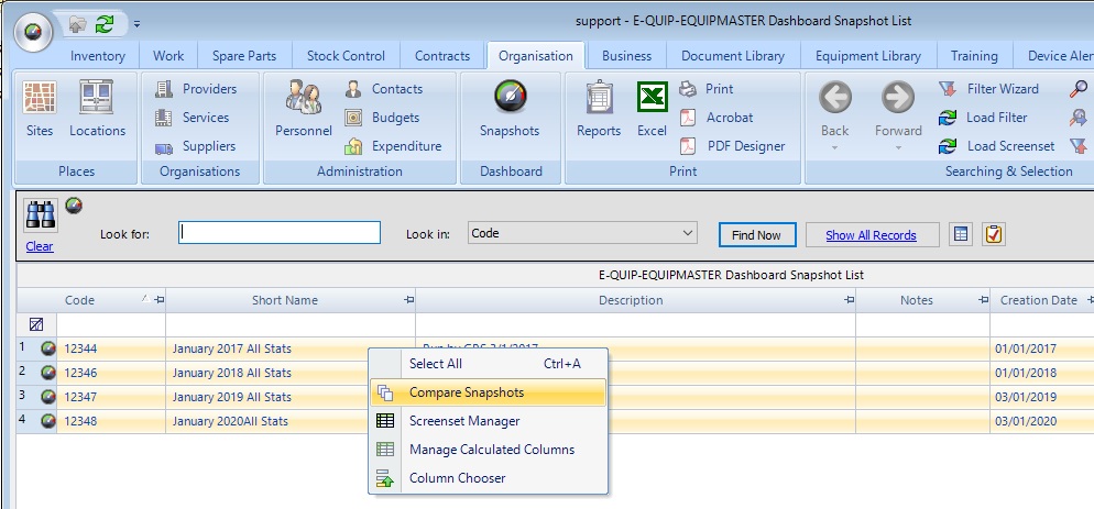
This is the purpose of the Performance Improvement Dashboard. Basically, it allows up to 10 dashboard snapshots to be compared so that changes in performance can be tracked. It is run from the Dashboard Snapshot summary screen. Just select the snapshots that you want to compare, right-click and choose Compare Snapshots. In the example below I shall be comparing four snapshots taken between 2017 and 2020.
The Performance Improvement Dashboard will then be displayed. By default it opens at the Settings page, which allows you to change line and bar chart colours. Unfortunately I don’t happen to have four years of realistic performance data lying around to use to illustrate this new feature; I’ve had to make do with adding random data into the database, so the charts below don’t illustrate any particular improvement measures, but they do give an idea of what is possible.
PPM Compliance
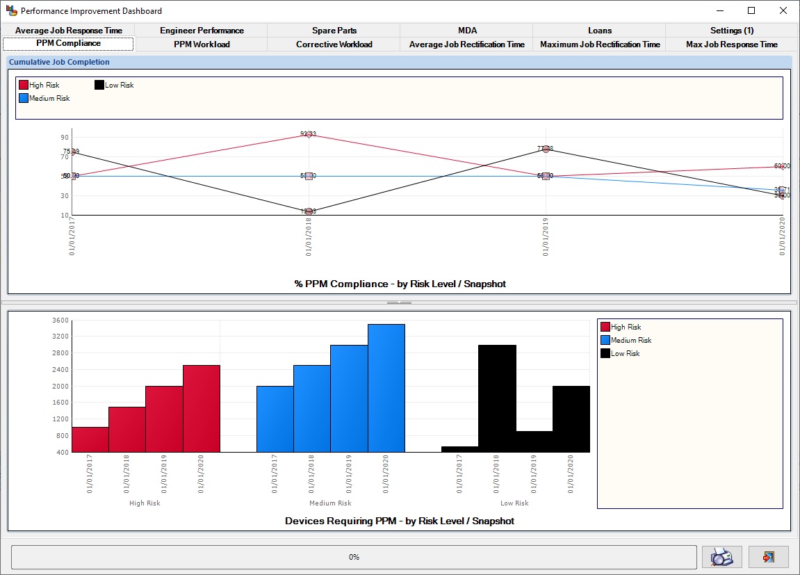
The upper chart shows percentage PPM compliance for each snapshot, with one line for each device risk level. We can see, for example, that the percentage compliance for high-risk devices improves significantly between 2017 and 2018, drops back to its original value in 2019 and then improves slightly for 2020.
The lower chart shows the number of devices which required planned maintenance each year, by risk level. Note the number of high-risk devices needing to be serviced increasing steadily over the 4-year period
PPM Workload
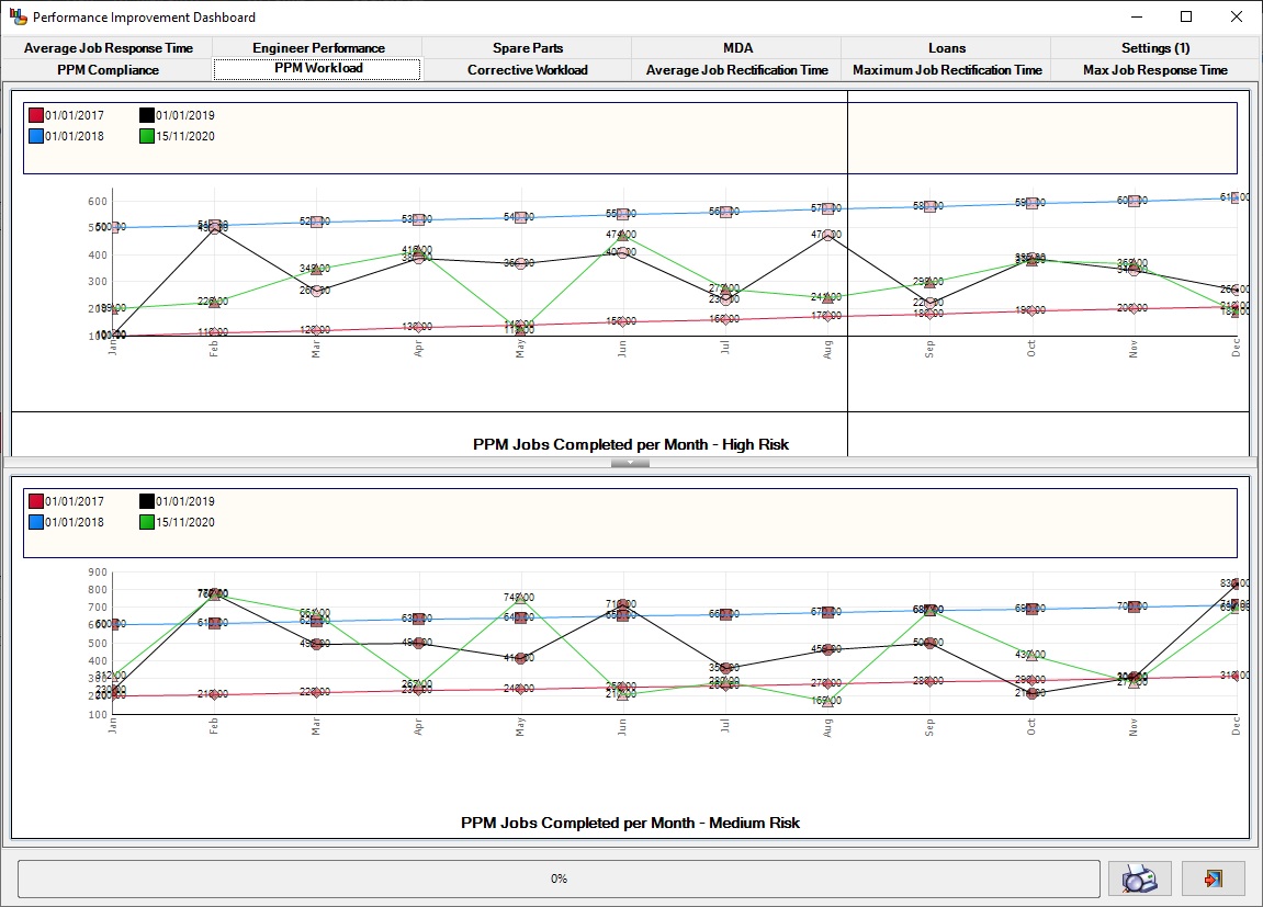
These charts show the PPM jobs completed each month for each snapshot. The upper chart is for high-risk devices while the other is for medium-risk devices
Corrective Maintenance Workload
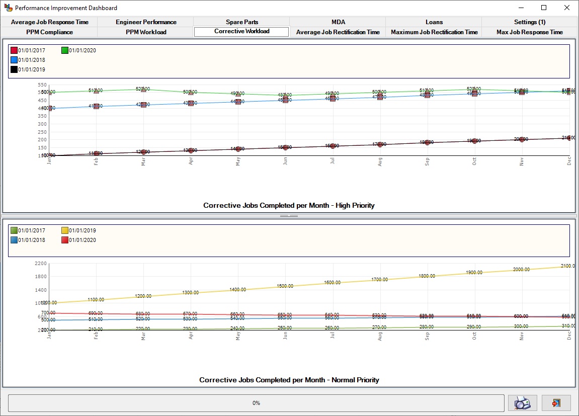
These charts show the repair jobs completed each month for each snapshot. The upper chart is for high-priority jobs while the other is for normal-priority jobs.
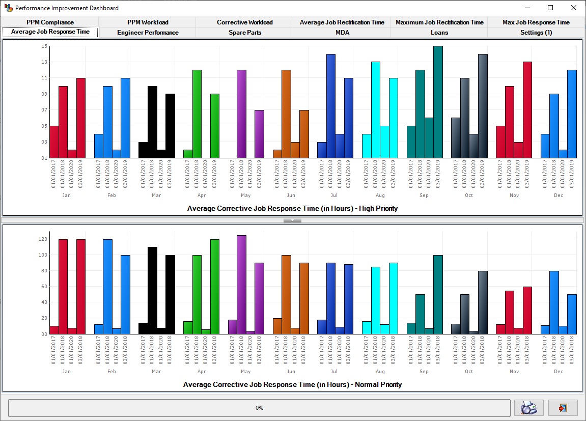
Average Repair Job Response Time
These charts show the average response times for repair jobs each month for each snapshot. The upper chart is for high-priority jobs while the other is for normal-priority jobs.
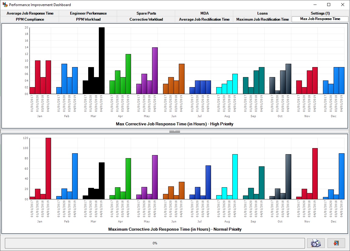
Maximum Repair Job Response Time
These charts show the maximum response times for repair jobs each month for each snapshot. The upper chart is for high-priority jobs while the other is for normal-priority jobs.
Clearly something happened in March 2019 to cause a dramatic increase in maximum response time for high-priority jobs.
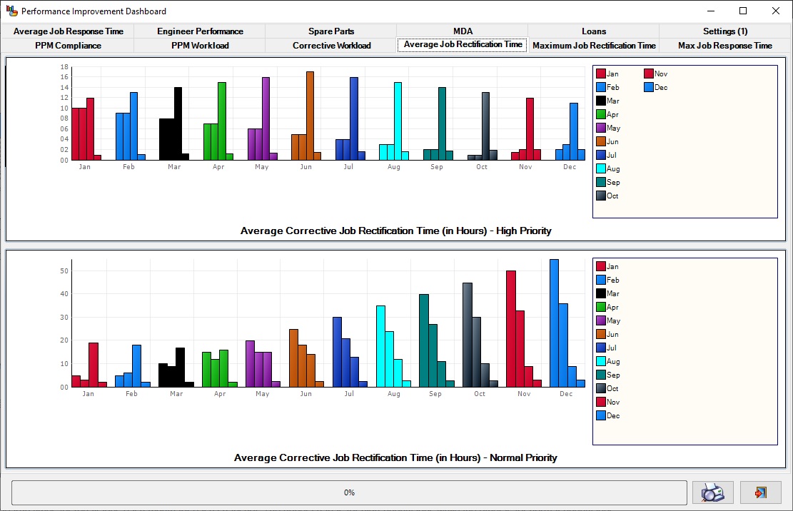
Average Repair Job Rectification (i.e. clearup) Time
These charts show the average clearup times for repair jobs each month for each snapshot. The upper chart is for high-priority jobs while the other is for normal-priority jobs.
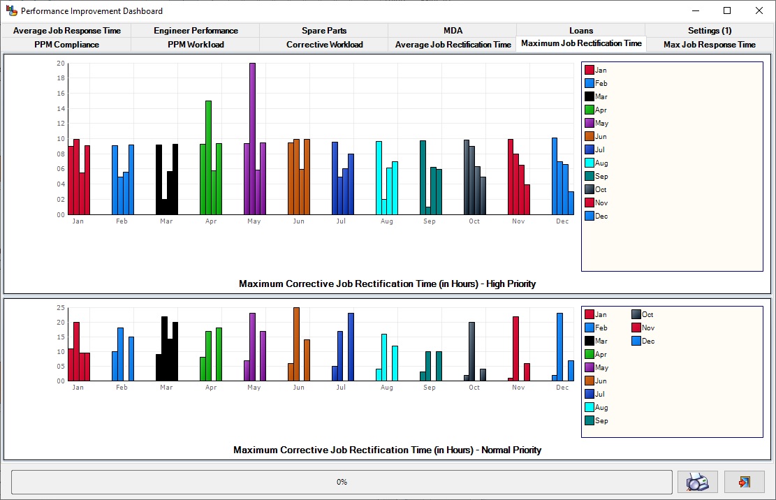
Maximum Repair Job Rectification (i.e. clearup) Time
These charts show the maximum clearup times for repair jobs each month for each snapshot. The upper chart is for high-priority jobs while the other is for normal-priority jobs.
Engineer Performance Summary
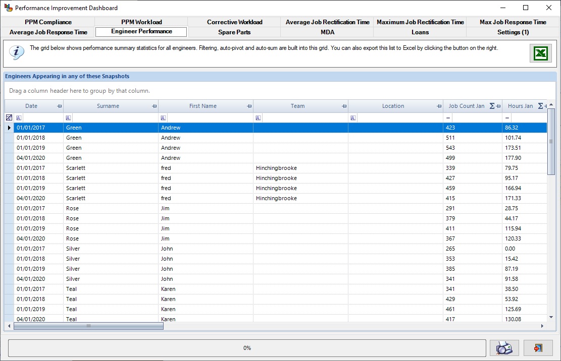
The grid shows monthly jobs completed and hours worked for all engineers in each snapshot.
Spare Parts Usage and Replenishment
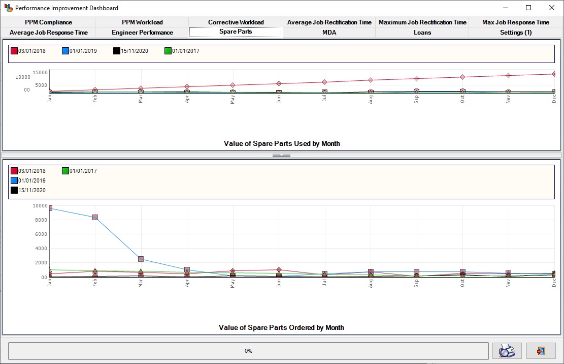
These two charts show the monthly value of spare parts used and ordered for each snapshot
Medical Device Alerts Closed
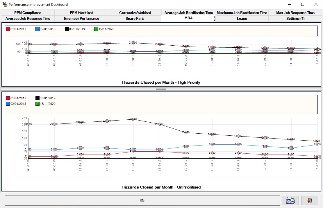
The upper chart shows the number of medical device alerts closed each month, per snapshot. The upper chart is for high-priority hazards while the lower is for unprioritised hazards.
Loans Issued and Returned
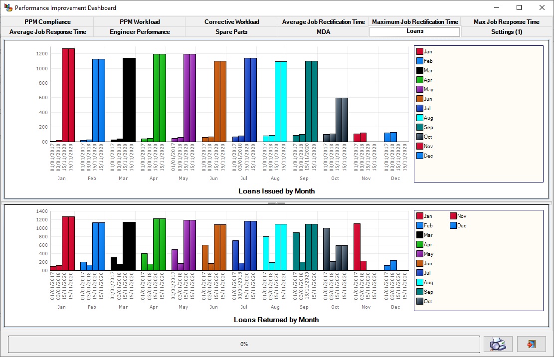
The upper chart shows loans issued per month per snapshot, while the lower chart shows loan returns.
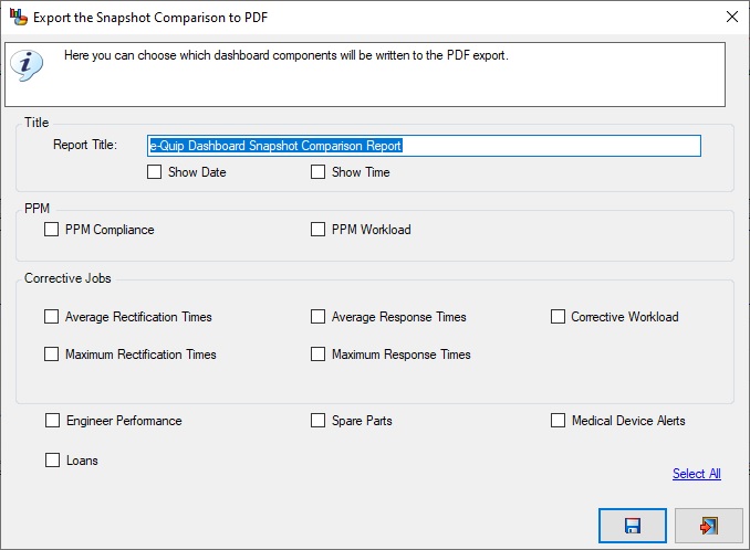
Export to PDF
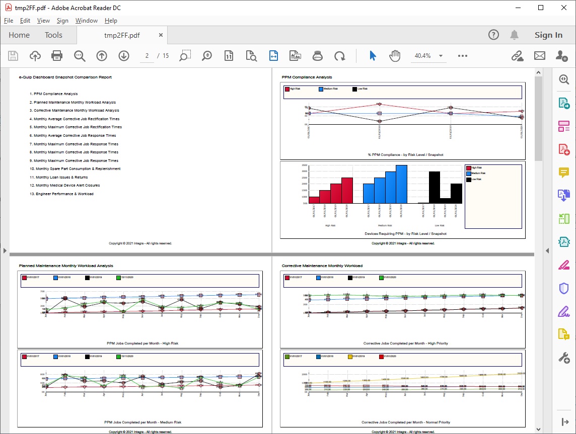
Naturally these reports can all be exported to PDF documents.
Let us Know What you Think
Any feedback that you have on this new feature is welcome.
