Defining Grid Layouts
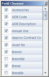
The original Column Chooser was a perfect example of the difference between “easy to learn” and “easy to use“. Tick the box to show a column – you can’t get much simpler than that.
Well, that’s certainly easy to learn, how about easy to use? Suppose you want to design your default layout for the equipment screen so that you see the following columns:
Equipment No; Serial No; Brand, Model; Category; Location; Age
How do you go about this?
Starting from the top you need to untick every field that you don’t want to see, which is not as easy as it could be as there’s no way of selecting blocks of columns. Finding a column to display can also be fiddly: you may need to scroll through the list to find the column you want. Once you’ve done that, what about the Age column? That’s going to be a calculated field, but that won’t appear in the Column Chooser until you add it to the grid (with Show/Hide Calculated Columns). Then, save the layout and you’re done. This involves one extra step, as saving grid layouts is not done from the Column Chooser but from a separate menu.
Except you’re not done, because up to version 1.19.0 saved grid layouts didn’t save calculated fields.
Back to the Drawing Board
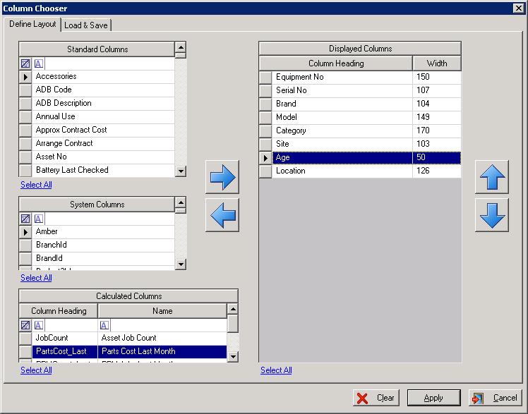
Ready for the next release, we have completely redesigned the Column Chooser to address all of the ease-of-use problems.
With the new Column Chooser you can:
a. Select multiple columns to show or hide using the Windows standard selection mechanism (left-click, ctrl+click, shift+click)
b. Easily select all columns, either to show or hide
c. Searching for the columns to add is made simpler using Excel-style filters
d. Searching for columns is simplified by grouping columns into categories: Standard, System and Calculated.
e. Designing, loading and saving grid layouts is all achieved using a single screen.
Also, to make creating printable grid layouts easier (to fit in with the new PDF Designer), the width of each column can be explicitly specified.


